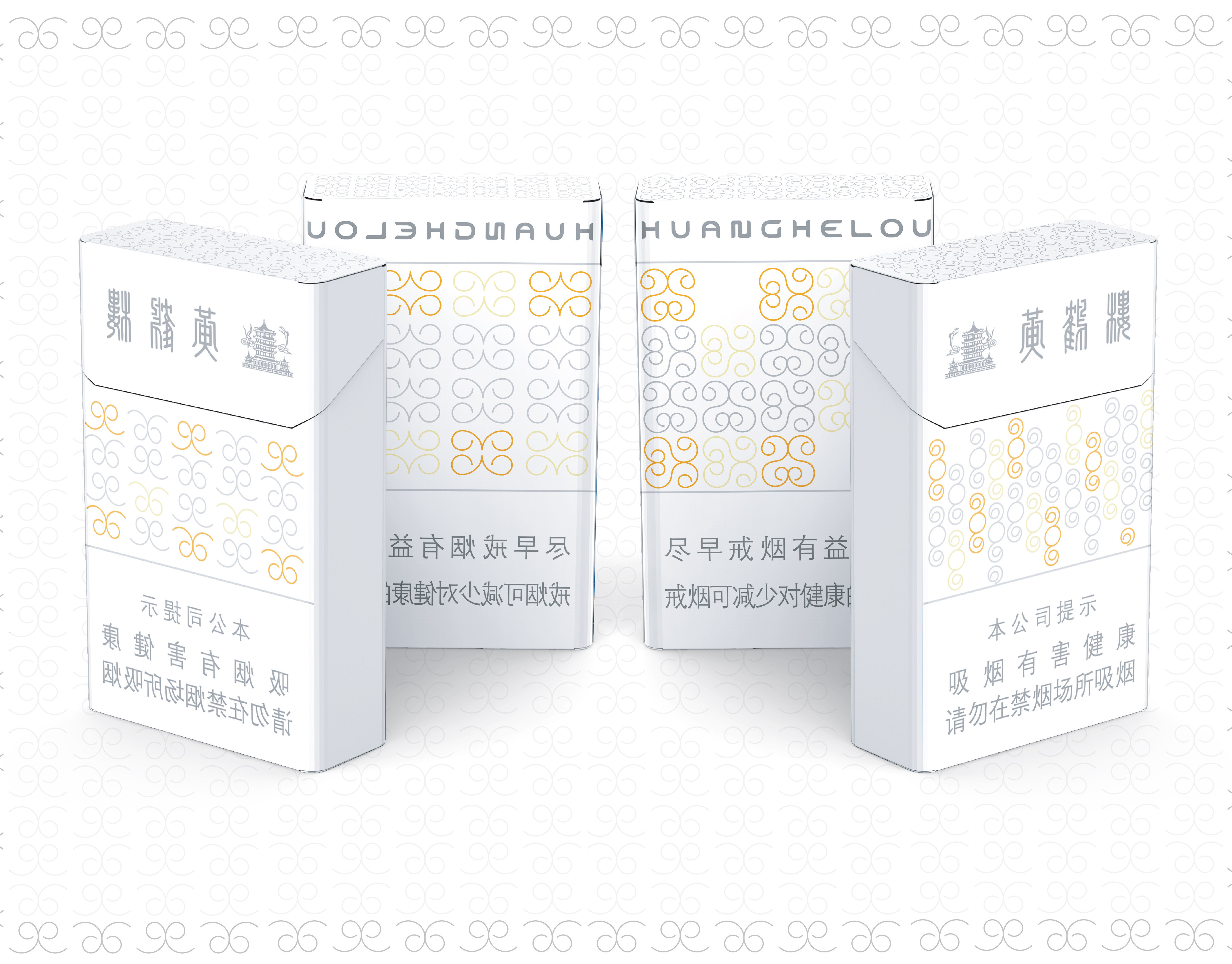
Type: Personal work
Software: Illustrator & Solidworks
Creative Field: Branding & Packaging Design & Graphic Design
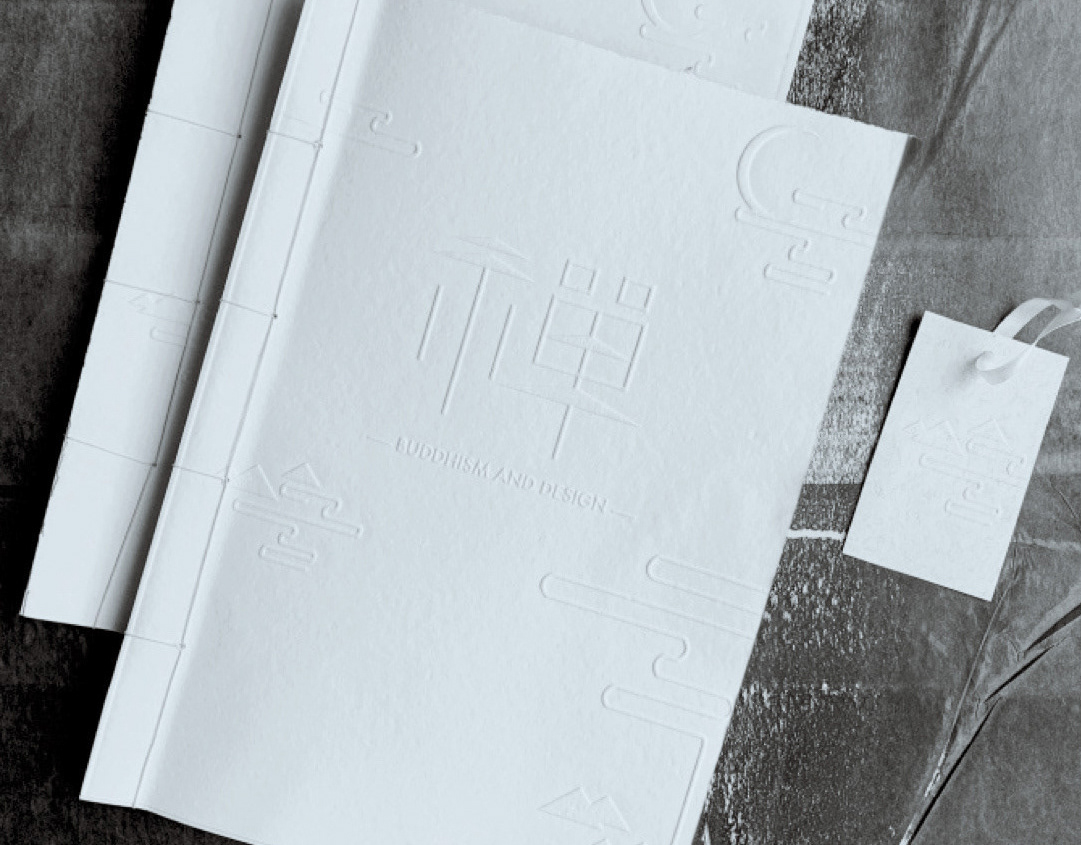
Collaboration with Titem KahinaMy role: Packaging Designer
INTRODUCTION
Zhuangzi was an influential Chinese philosopher who lived around the 4th century BC. He believed that a person can travel beyond their limitations. He strongly emphasizes the importance of physical health and mental health. It perfectly corresponds to our brand-Zhuang-tea, a natural tea, good for our health and life.
Graphic design:
The head of Buddham which is a national symbol of China. The head of the colorful Buddha presents the Chinese culture and attracts a young adult audience to drinking quality teas.
Packaging:
The packaging of tea refers to the local Chinese culture. It has the shape of “yin and yang symbol” ( Yin is female and yang is male),called Taijitu. The image consists of a circle (which represents the world) divided into two teardrop-shaped halves—one white(yin) and the other black(yang). It represents one of the most fundamental and profound theories of ancient Taoist philosophy. At its heart are the two poles of existence, which are opposite but complementary. Each packaging is filled with four different types of loose leaf tea.
The packaging can not only share the local culture and evoke feelings, but it can also bring a new experience to improve the customer’s life! The fashionable tea brand can help people gain a better understanding of the different functions of tea and provide an easier way for them to improve their health.